


.png?cropw=1629.8134440192007&croph=916.7700622608003&cropx=139.01841437862348&cropy=649.6321655168036&cropmode=pixel#)


.png?cropw=2304&croph=2304&cropx=814.2000301504133&cropy=0&cropmode=pixel#)


.png?cropw=2304.0000000000005&croph=2304.0000000000005&cropx=975.9171890617861&cropy=0&cropmode=pixel#)
.png?cropw=2304&croph=2304&cropx=815.6598955569706&cropy=0&cropmode=pixel#)


.jpg?cropw=2693&croph=2693&cropx=1304.337118523776&cropy=0&cropmode=pixel#)
.jpg?cropw=2733&croph=2733&cropx=636.5439718837721&cropy=0&cropmode=pixel#)


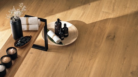
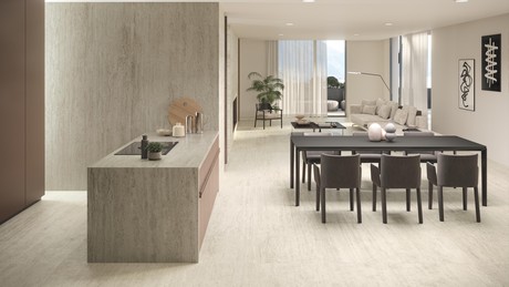
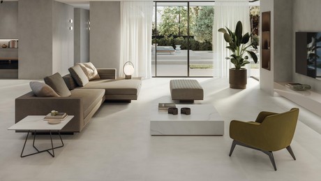
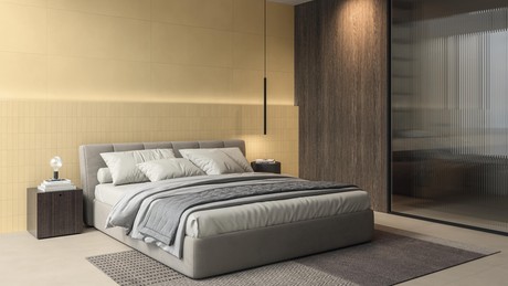
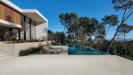
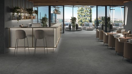
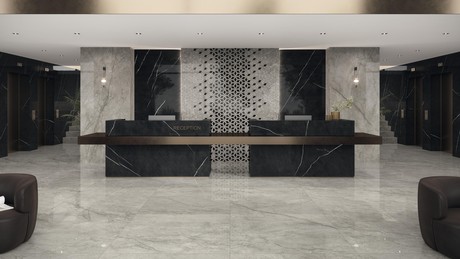
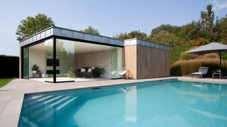
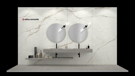
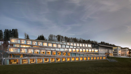
Stone effect porcelain tiles are one of the most popular solutions in interior and exterior design due to aesthetic versatility, durability and ease of maintenance. With endless application possibilities, stone effect ceramic surfaces bring a natural look to rooms, adapting to any style. The stone effect of Atlas Concorde porcelain has now established itself as an attractive architectural element, but also and above all an essential element in interior and exterior design. For private homes, but also for commercial spaces.

Trend
Boost Icor in collaboration with Marco Casamonti - Archea Associati

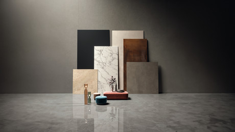
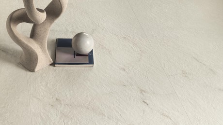
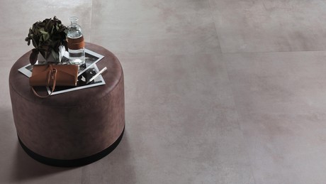
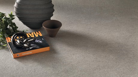
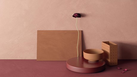
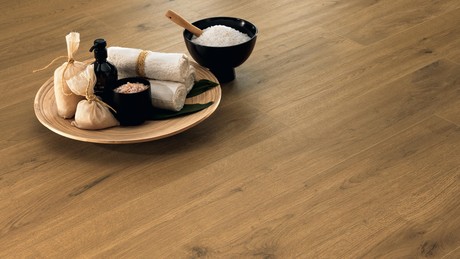
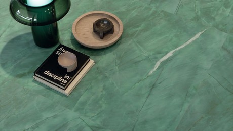
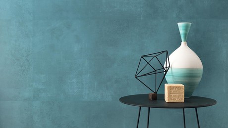
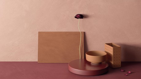
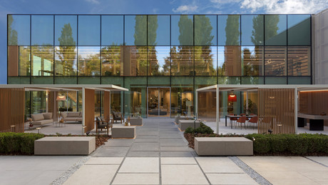
In particular, the stone-effect collection Boost Icor is characterised as warm and welcoming with a wide range of ceramic surfaces and decors with a versatile feature to suit every space. Boost Icor's warm and welcoming colour scheme with its infinite nuances stems from the fusion of the typical warmth of limestones, the compact and monochrome limestones with a sophisticated natural beauty. This specificity lends itself to illuminating and relaxing rooms, through a sensorial peace of mind due to the very softness evoked by the material.
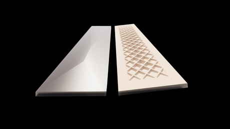
A wide range of colours is available: Bone is the white of the collection, Dust a light grey, Dune has straw shades, Oyster is a modern grey-beige, Crete is an earthy shade, while Sideral is the darkest grey. Boost Icor's decor range is very wide: three interior solutions, Railway, Mosaic Furnace and Mosaic Chevron, and two modular mosaics, Pebble and Combo.


The Collaboration with Marco Casamonti / Archea Associati for Boost Icor
Marco Casamonti / Archea Associati , founded in Florence in 1988, was commissioned by Atlas Concorde to create some digital environments for the Boost Icor collection.We interviewed the architect and founding partner of the studio, Marco Casamonti, who oversaw the realisation.

How would you define this collaboration with Atlas Concorde? ‘It was a different experience because in a project we usually first imagine and design the architectural space and then, based on the use and the elements that define the characteristics of that space, we choose the most suitable materials. In this experience with Atlas Concorde, the path was reversed. Imagine habitable environments and spaces starting from materials. This is a new experience for us, even amusing from a certain point of view, but perfectly coherent with our way of working in which materials certainly play a central and priority role over architectural writing, in the sense that we have always been more interested in the content of a text than in calligraphy’.
From what point of view during the collaboration did your affinity with Atlas Concorde become apparent?‘I believe that, beyond architectural language, style, which I mentioned earlier as a question of calligraphy versus text, it is the substance with which architecture is realised that is decisive for the outcome of a project. Architecture is made of space, of light but also of tactility, of surfaces, of matter and, therefore, of knowledge and use of materials that define its character. Many of these, in construction, are realised through metamorphic transformations in which pressure and temperature are present, these are alchemical processes that have always attracted us, ceramics is no exception to this process of transformation and in fact it is one of the materials we work with most frequently.
In terms of inspiration for making these digital sets, what guided you?‘The tactility, grain and natural colours of the materials produced by Atlas Concorde with the Boost Icor collection. We had to grasp the texture, the surface, the tactility in order to be able to imagine and design environments suited to this type of material and its identity’.
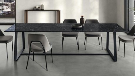
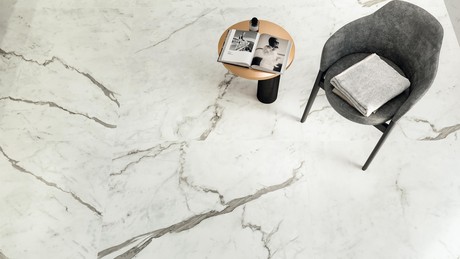
What was the objective for the realisation of these digital environments?‘We started by imagining architectural spaces that were not overly characterised because Atlas Concorde's objective was to make people understand the flexibility and ductility of using these materials. The digital environments created must in fact demonstrate how this material lends itself to multiple uses, different and varied architectural languages’.
What is the fil rouge of your digital images realised for Atlas Concorde Boost Icor? ‘It is, as mentioned, a series of cladding materials suitable to be used in many environments that characterise the domestic space even if, obviously, the natural and relaxing chromatisms make them particularly persuasive and coherent with spaces that can best interpret such characteristics: from the living room to the wellness space, from horizontal to vertical surfaces up to façade coverings’.
In closing, what would you like to add about this experience with Atlas Concorde? ‘Every production company keeps a history and a path that is always interesting and original, specific characteristics, its own particular point of observation and, therefore, getting to know Atlas Concorde for us was a way to enrich our specific culture and passion for materials and materials that was not born from today as the book ‘Materials’, published by Forma, testifies.


