A review of the main highlights and drivers of design of the recent 2024 Milan Design Week confirms the interest in color to be a trend continuing from the previous edition, albeit proposed and interpreted with new conceptual and creative nuances.
The new color neutrality
17 May 2024
Particularly striking in the many projects at the Fuori Salone was brands’ and designers’ interest in the idea of color neutrality. Note that this word should not be understood literally as an absence of color, but rather proactively conveying a new perspective rich in meaning. The use of color is conceived as a driver of design akin to a progressive stripping and refining in order to arrive at a radical, essential meaning. This new neutrality is to be understood as an array of elements expressing the desire and search for balance and inner harmony in living spaces, especially for living room wall decorations that enclose the space and enhance it, the Pantone color for 2024 being a clear example. In fact, as explained on the site, "PANTONE 13-1023 Peach Fuzz captures our desire to nurture ourselves and others" with agentle lightnessthat doesn’t overpower, but rather remains present underneath, almost invisible but only apparently neutral because it is perceived at a deeper level, calming and reassuring. A further nuance concerns the idea of subtraction to bring out and highlight the essence of the form and its beauty.
It is therefore a "new" apparent color neutrality, because it is actually rich in meaning, as always happens in a design that focuses on the search for simplicity as essentiality.
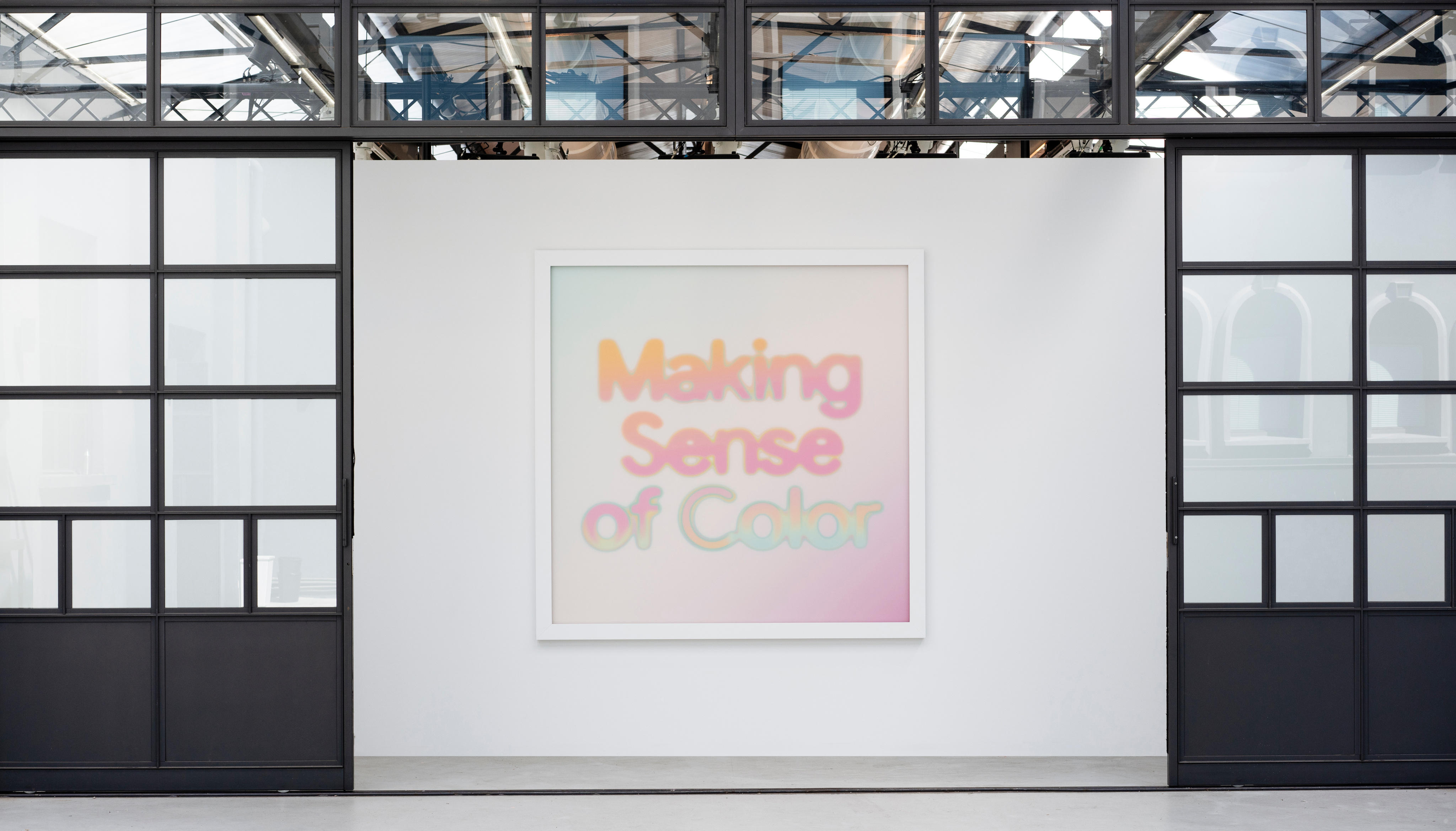
Making Sense of Color, by Google Fuori Salone 2024
Proposed during Fuori Salone 2024, the Making Sense of Color exhibition organized by Google with the art and research laboratory Chromasonic inside a former garage in Milan presented the American brand’s reflection on the relationship between technology and color with the aim of showing its more ethereal and sensitive side. The experience offered in the various steps of the exhibition was intended to "eliminate the boundaries between sound and color," as stated by Ivy Ross, Vice President of Hardware Design, UX, and Research at Google. In this interesting installation, conceived as a journey through various stimulations, an idea of "color neutrality" was therefore shown not so much in its chromatic meaning, but in its ability to become a tool for perceiving one's inner world.
Adrenalina meets the Remo Brindisi House Museum, Design Variations Fuori Salone 2024
The Marche-based brand Adrenalina, supplier of both residential and contract furnishings, presented an installation at Design Variation featuring iconic products revisited in total white by various designers for the Remo Brindisi House Museum, an architectural space designed by Nanda Vigo where works of art and design coexist. Large photographic panels evoking the House Museum formed the backdrop for the sofas, armchairs, seats, or furniture accessories – like the Atina or Lov white edition armchairs by architect Simone Micheli – "stripped" of color to highlight their underlying stylistic matrix and the essence of the design that represents them. In a positive short-circuit, the whiteness of the walls connects with the whiteness of the products for a "new" neutrality that regenerates and enhances the essence of the forms and design of the architectural context.
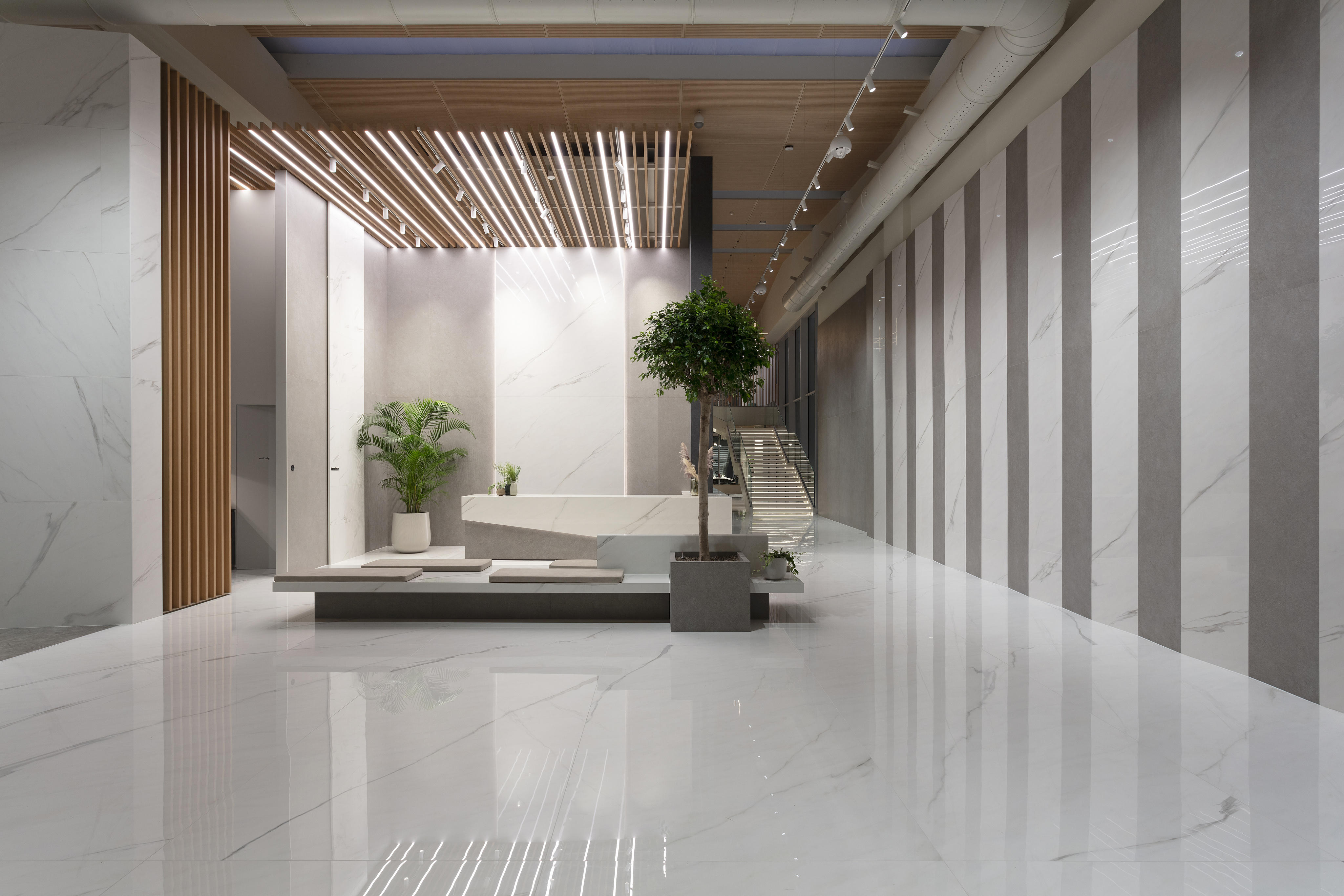
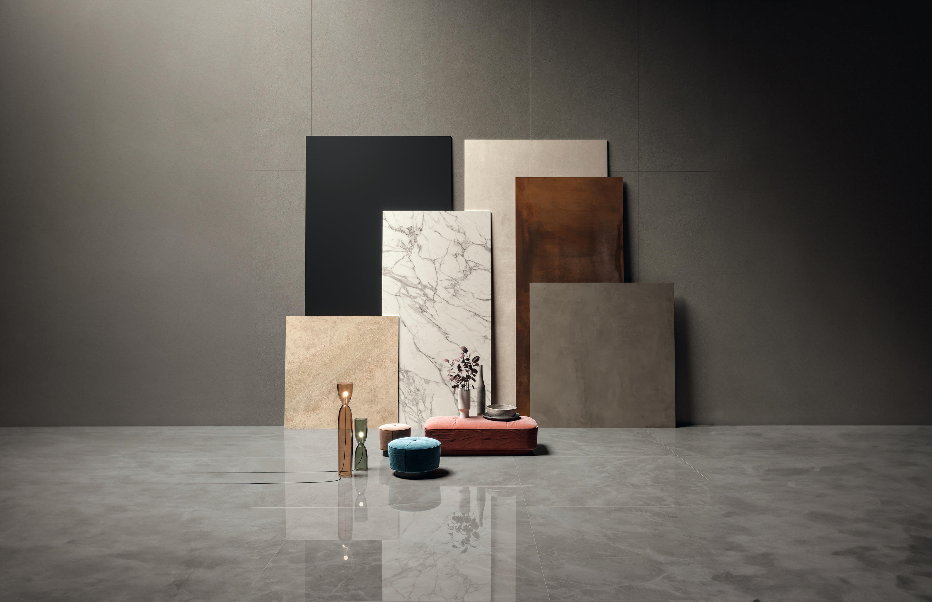
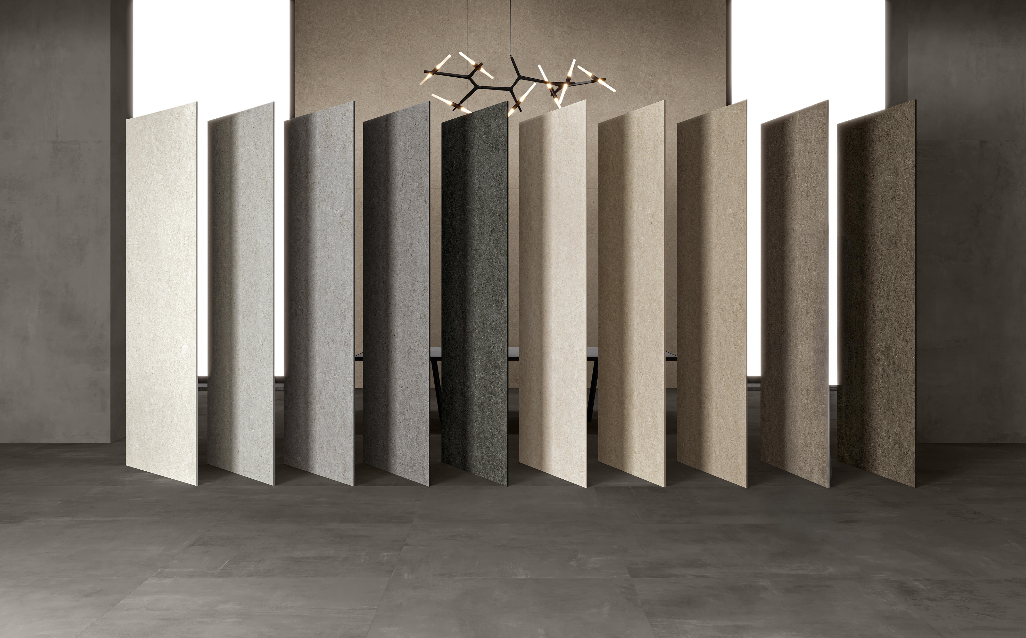
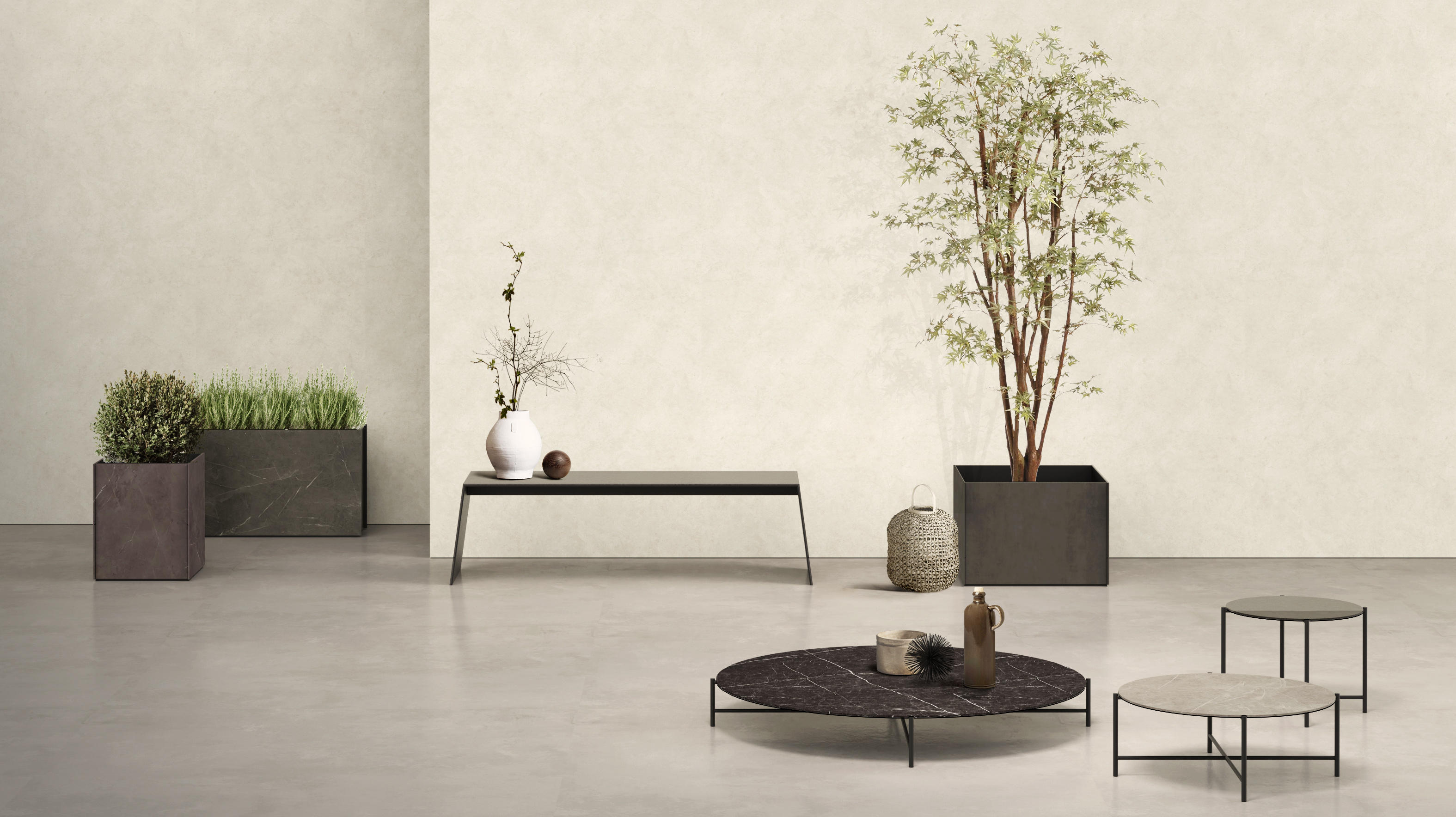
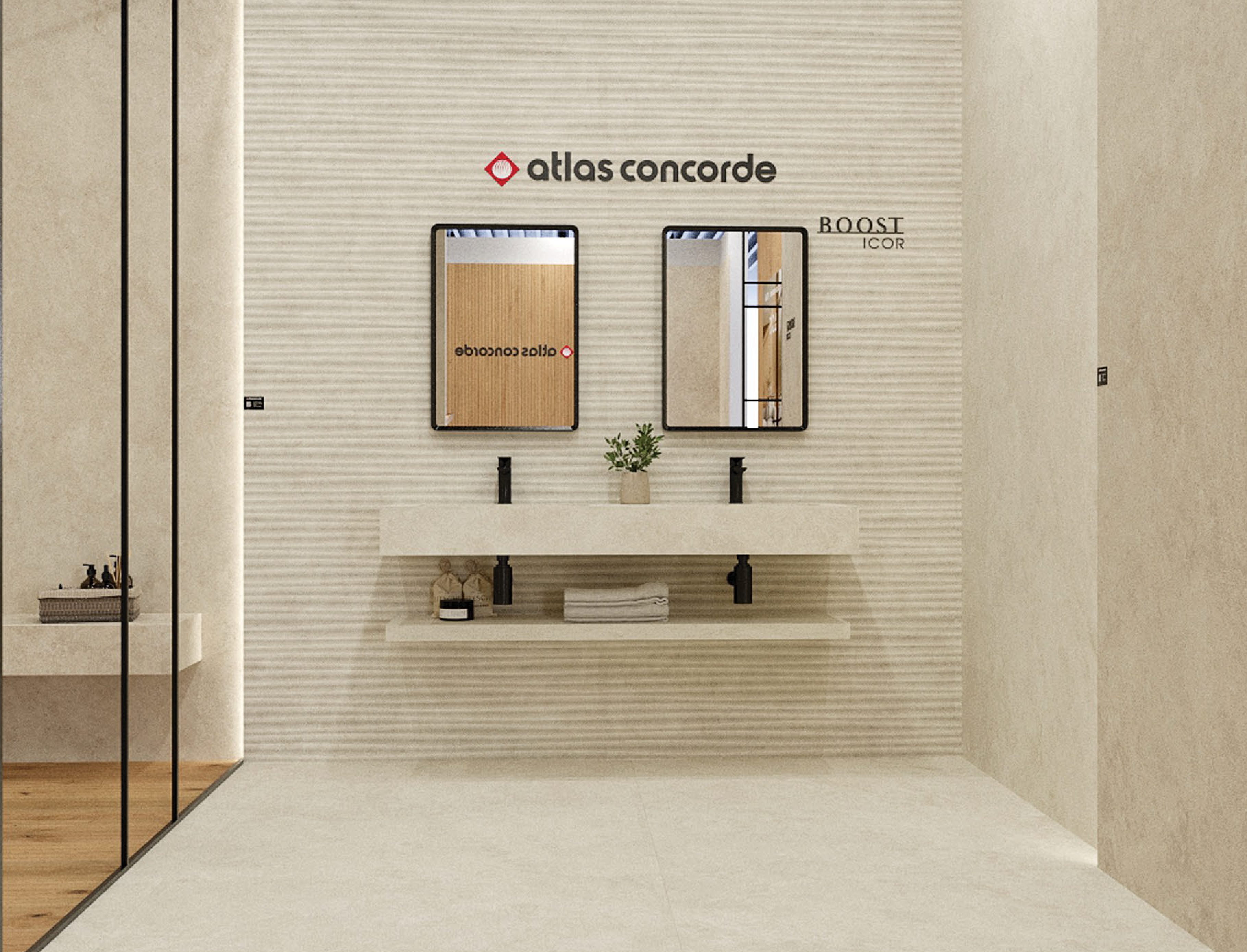
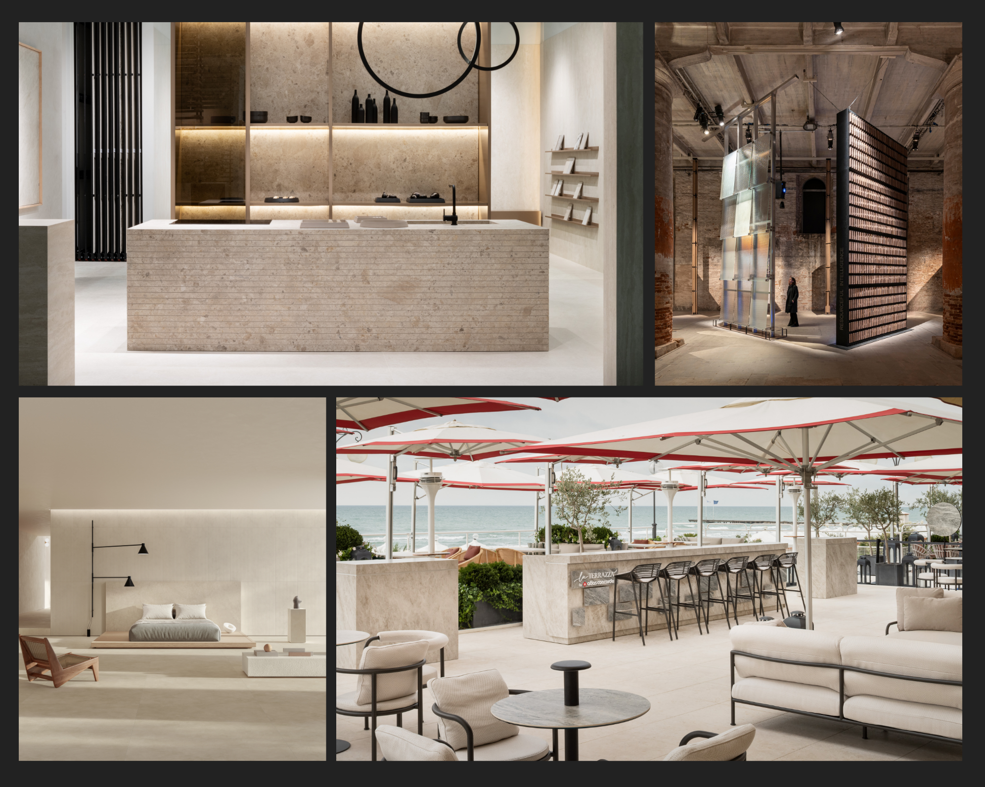
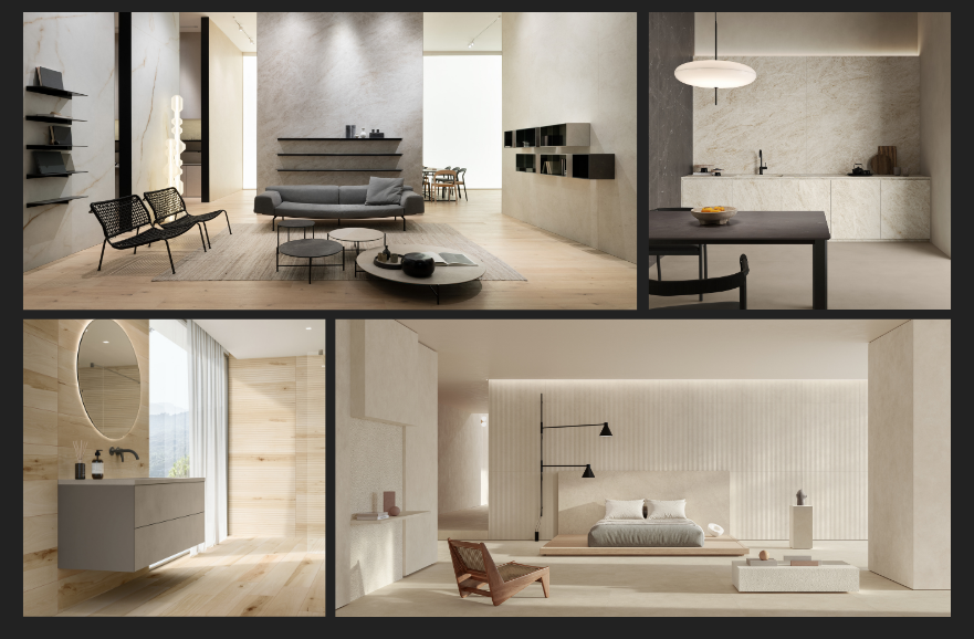
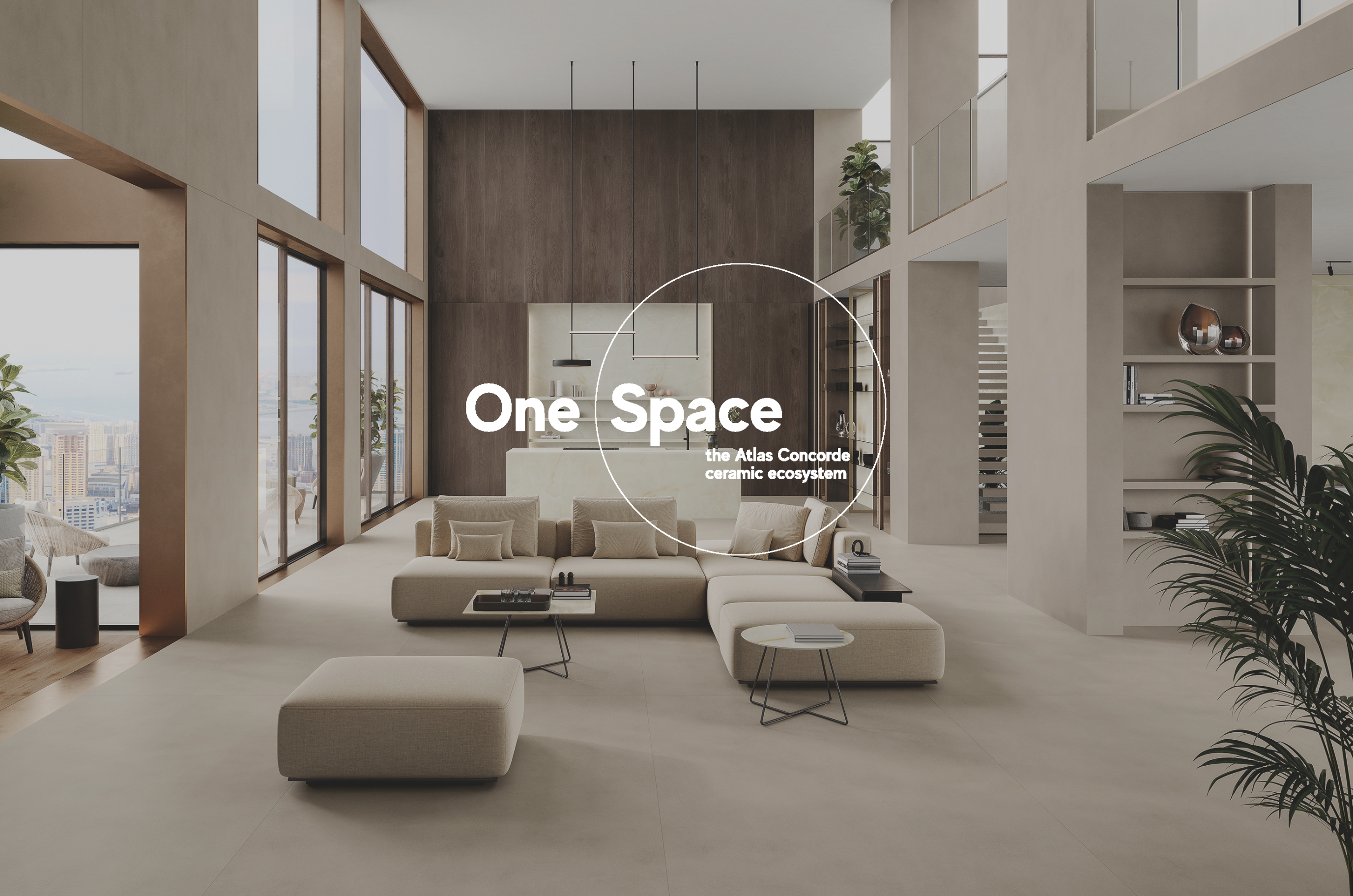
Boost Balance Collection, Atlas Concorde
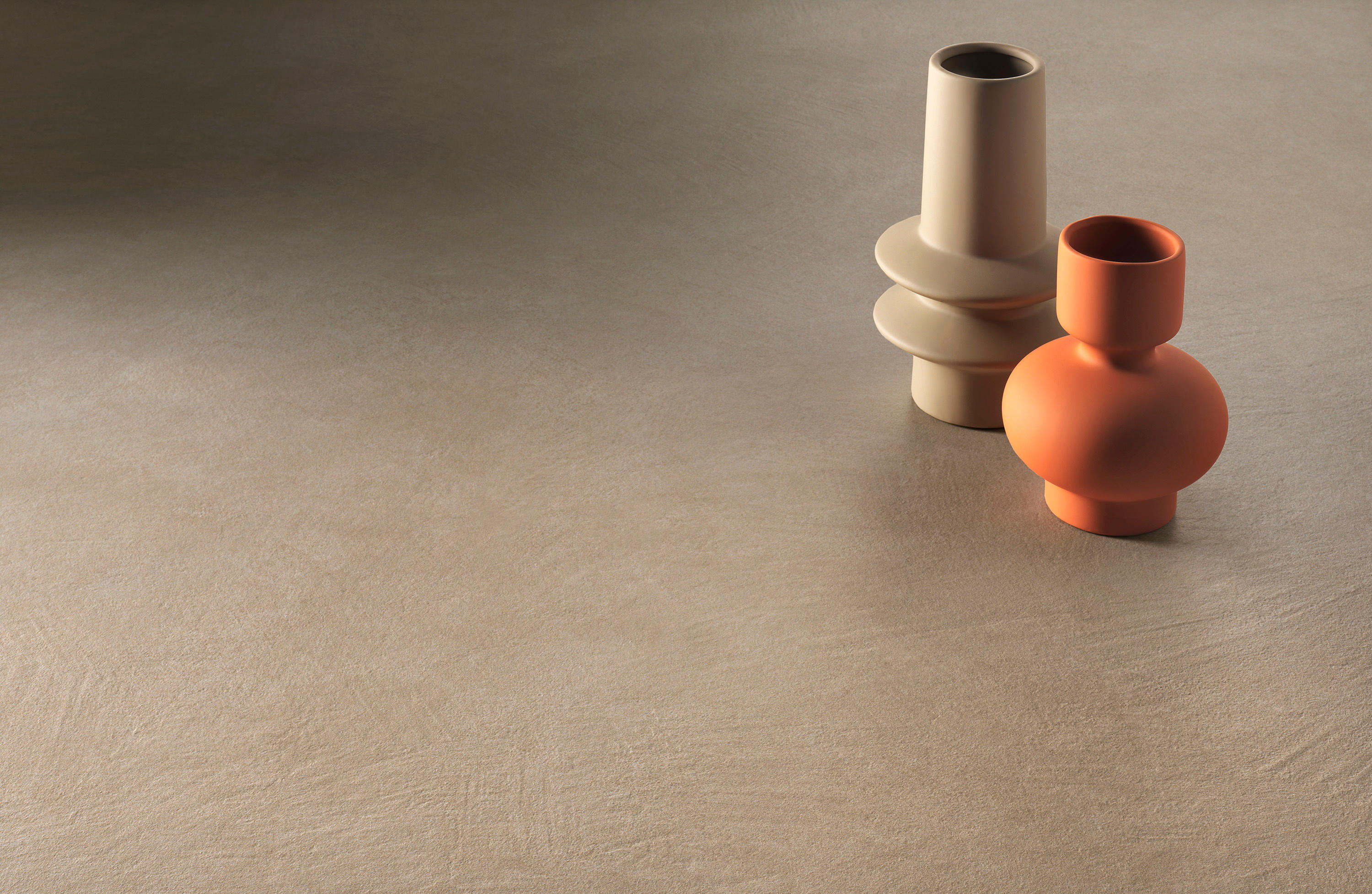
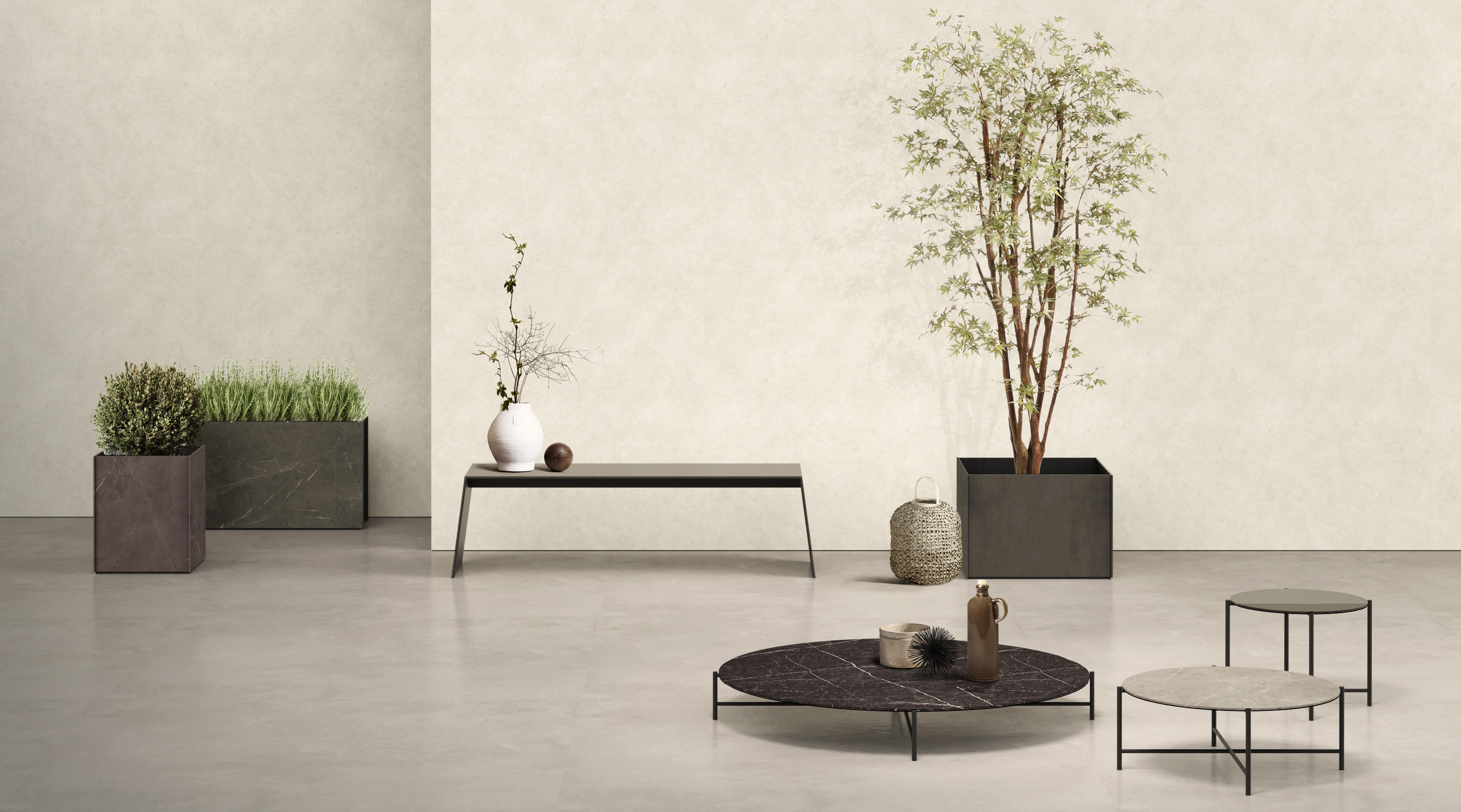
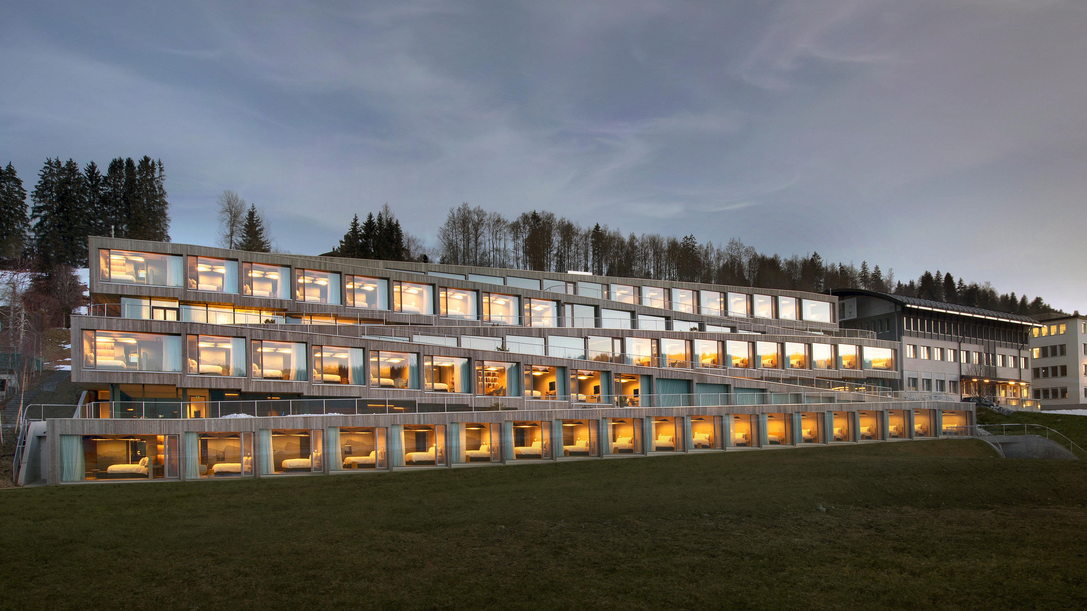
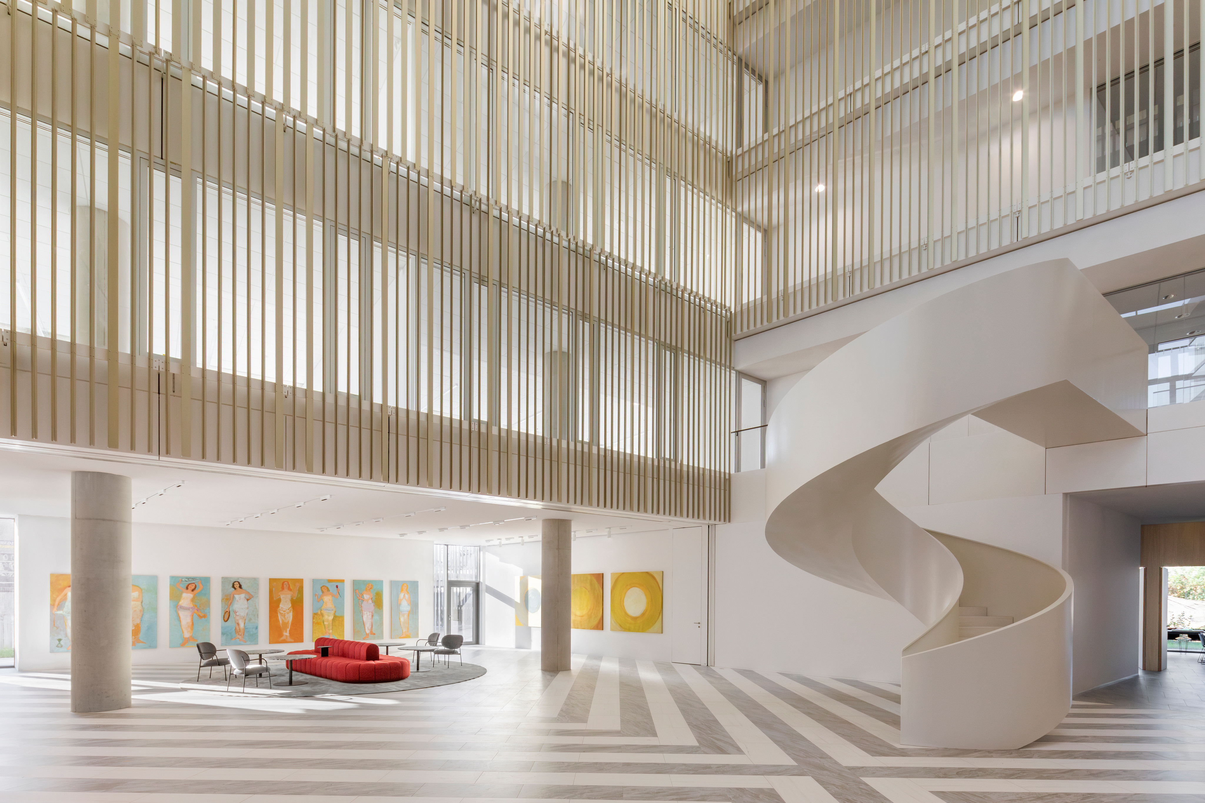
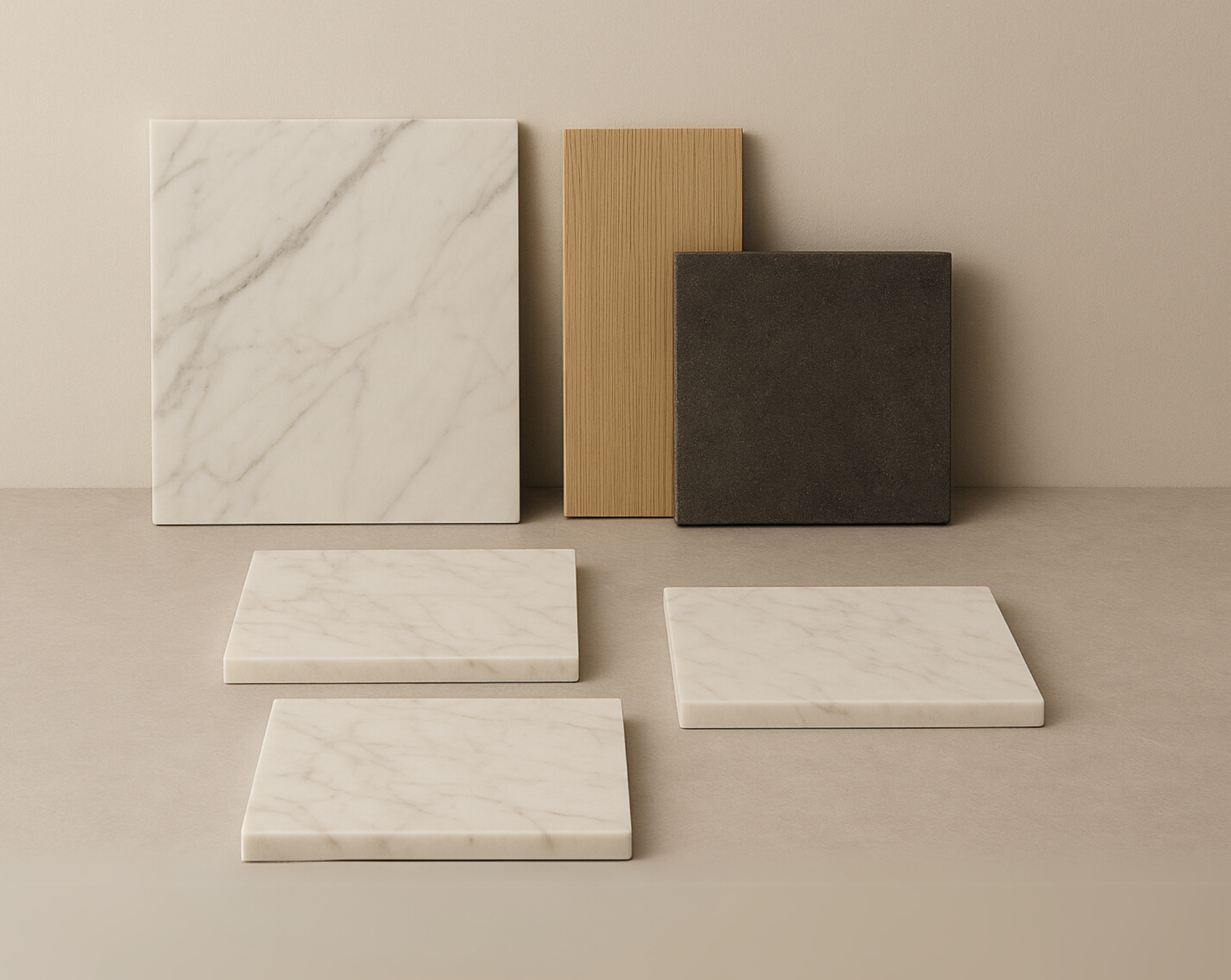
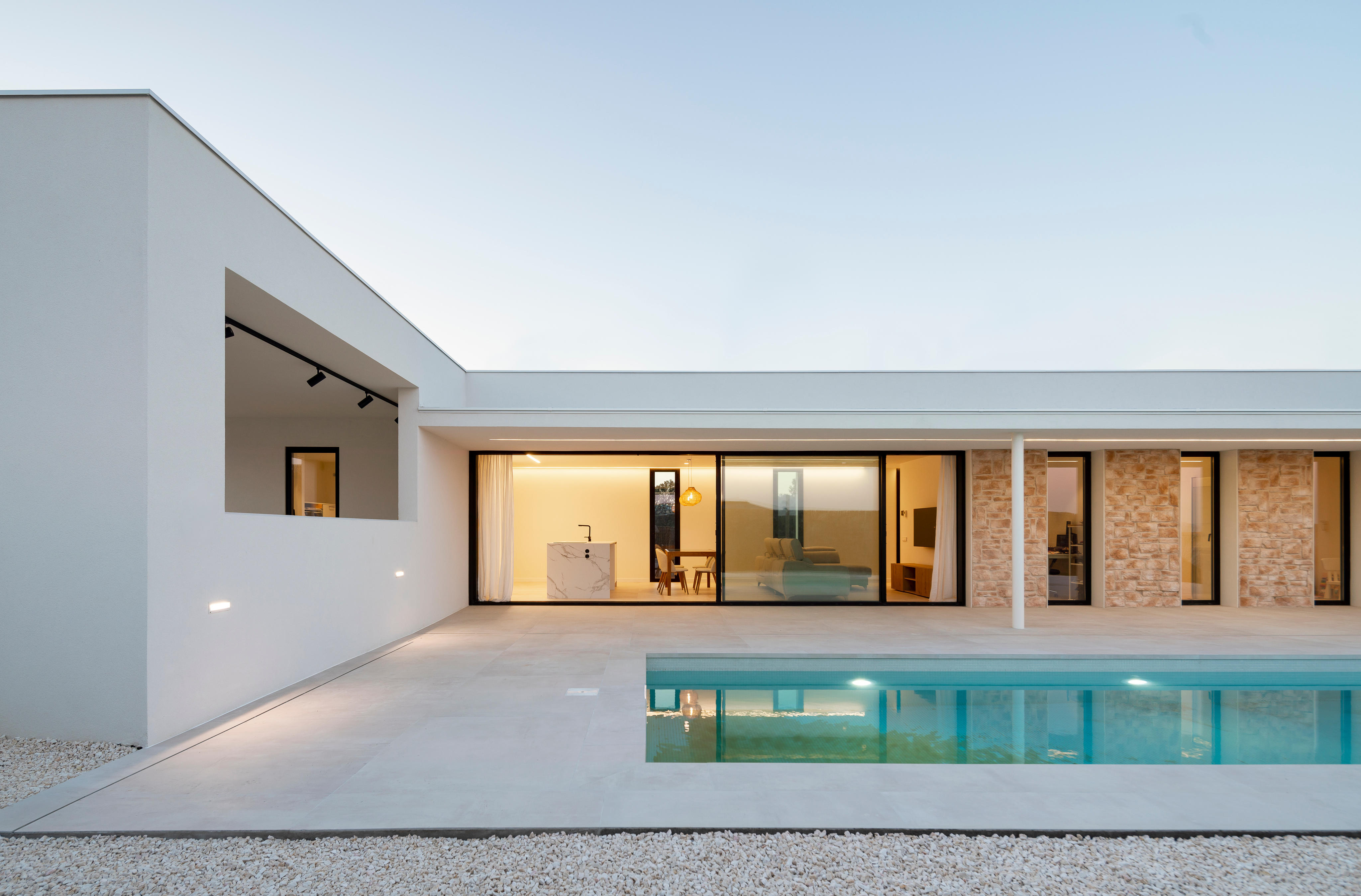
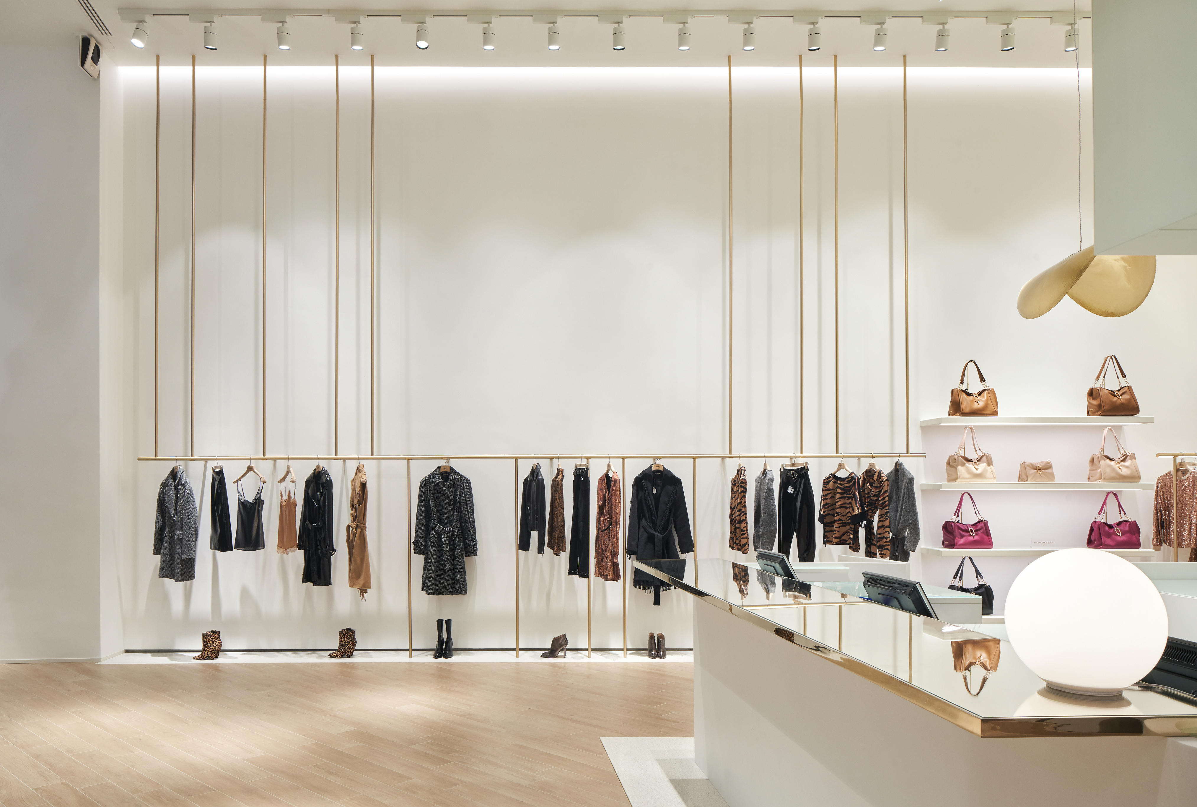
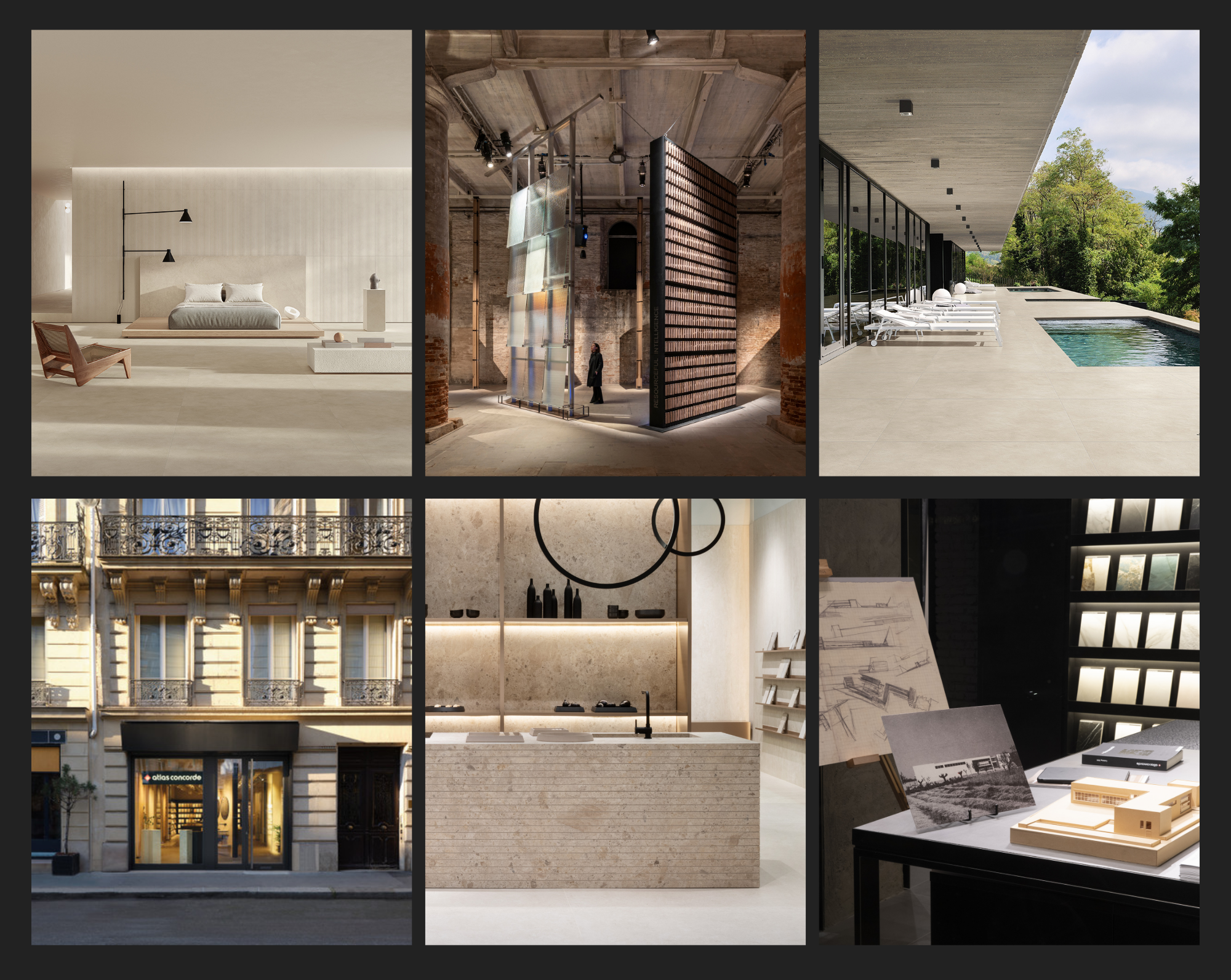
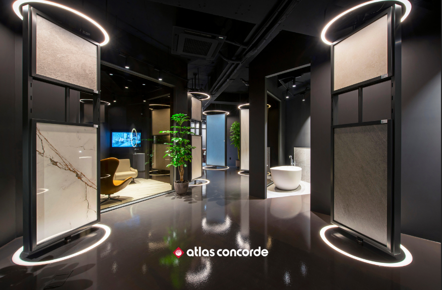
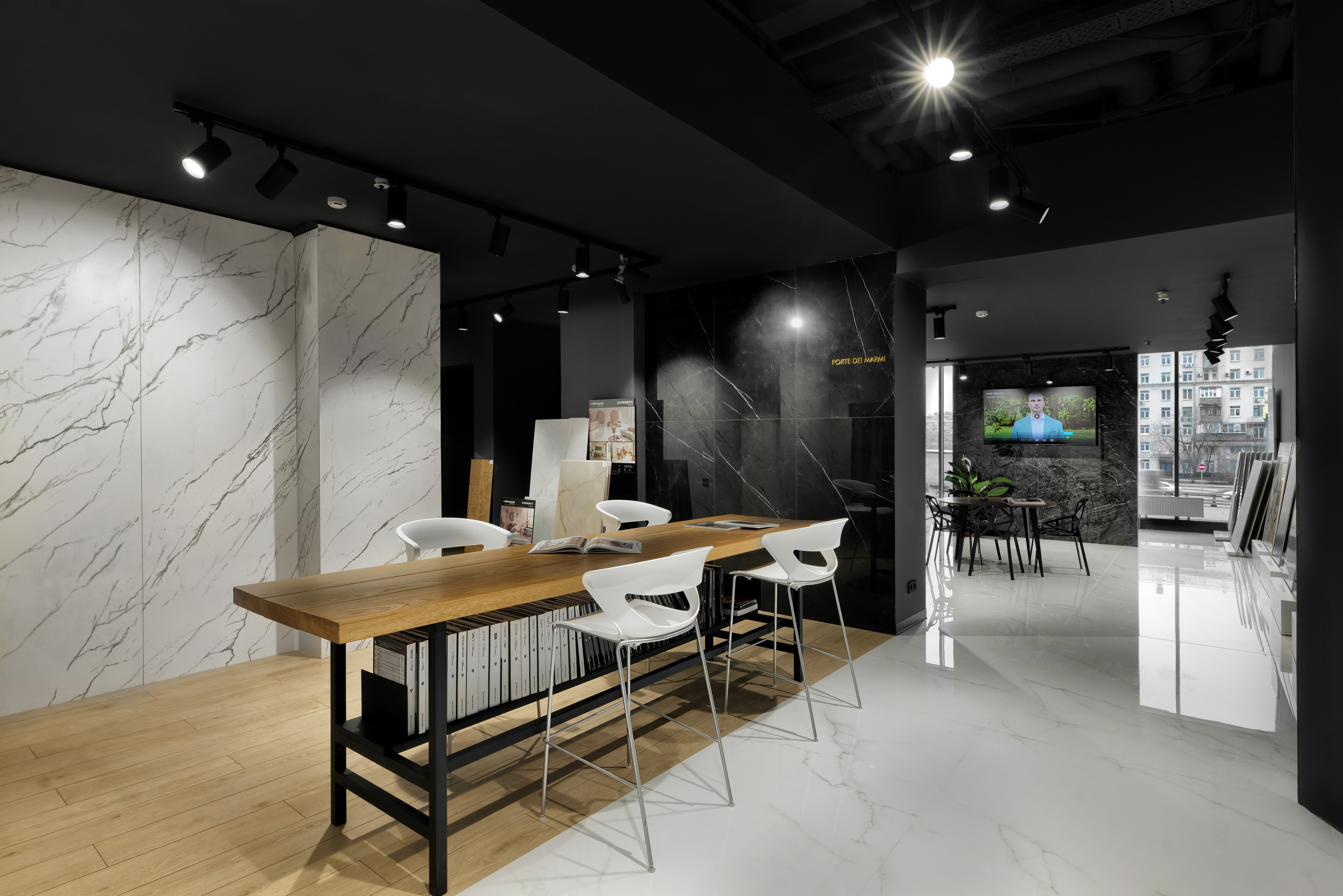
The color choices of the porcelain tiles in the Boost Balance collection also reflect a conception of both indoor and outdoor living that is deeply representative of the interior space, in a constant dialog between interior and exterior. A "new color neutrality" that, evoked by Boost Balance porcelain tiles both on the walls of modern rooms and on open-plan floors that connect to the living room, is enhanced by a "sophisticated simplicity of the surfaces" that on the whole is deep, uniform, and balanced. Boost Balance's color palette transforms walls and floors into welcoming canvases with soft, neutral colors that resonate with one's moods.
For a designer or retailer looking for ideas for living room walls reflecting a "new neutrality," it might be worth considering:
Essential Simplification: designing to get to the heart of the matter and the essence of experience
Existential Regeneration: conveying the idea of living that reflects its deep essence through wall and flooring claddings
Emotional Resonance: conceive of light colors, such as white, as an ideal color for living room floors to create emotional resonance










.jpg?cropw=4096&croph=2654.2479700187387&cropx=9.695217308093677e-13&cropy=76.7520299812622&cropmode=pixel&quality=75#)









.tif?cropw=4036.303976681241&croph=2705.4159900062464&cropx=59.69602331875912&cropy=25.584009993753906&cropmode=pixel&quality=75#)
.jpg?cropw=4096&croph=2978.1919633562356&cropx=0&cropy=93.80803664376384&cropmode=pixel&quality=75#)

.jpg?cropw=4096&croph=2304&cropx=0&cropy=215.39045431878446&cropmode=pixel&quality=75#)
